Design Process
Analyze
Evaluate
Prototype
Ideate
Define

How we found a solution
Understanding our Users
User Reviews
User Interviews
Personas
Card Sorting
Information Architecture
Low Fidelity Wireframes
High Fidelity Screens
1
Understanding our Users
User Reviews

We then categorized it into 3 major categories:
- Poor navigation/onboarding
- Information Overload for first-time users
- Customer support
- Transparency
We did our research with 25 users of booking.com, which included few new users who had a few usability issues.
2
User Interviews
We designed a series of targeted questions for the interviews, including:
1- Walk me through the booking process on booking.com
2- As a first-time user did you find it easy to navigate through the application?
3- Did you feel welcomed while using the application/ did the experience feel personalized?
4- What do you like and dislike about the application?
5- Was there a time you felt lost or confused about where to go and what to do on the application?
6- In your opinion, what is the most important feature of the application?
7- Do you have any feedback or suggestions to make the booking experience easier or more efficient?
Why Booking.com ?

Booking.com has become one of the largest travel
e-commerce companies in the world.
Despite its success, concerns have been raised regarding the website's user experience due to the abundance of information presented to users.
Hence, we took on the task of redesigning Booking.com aiming to enhance usability, simplify the booking process and enhance functionality for first-time users.

Poor navigation &
onboarding
First-time users require onboarding to ensure easy accessibility and navigation through the application
Compared to the website, the mobile application needs to prioritize improving usability with minimal yet essential information
Users are not able to get immediate support, which can cause delays in the booking process when customers have queries or are uncertain
With a lot of information to browse through, it gets overwhelming and confusing for the user
Information Overload
Customer support
Mobile optimization
User Personas

Onboarding
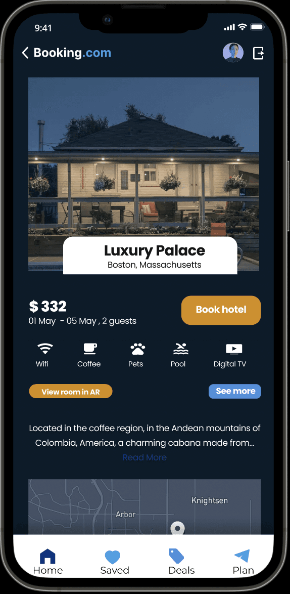
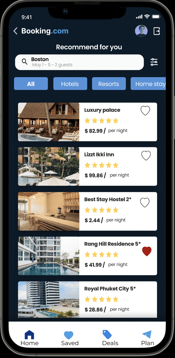
Home page
Flights
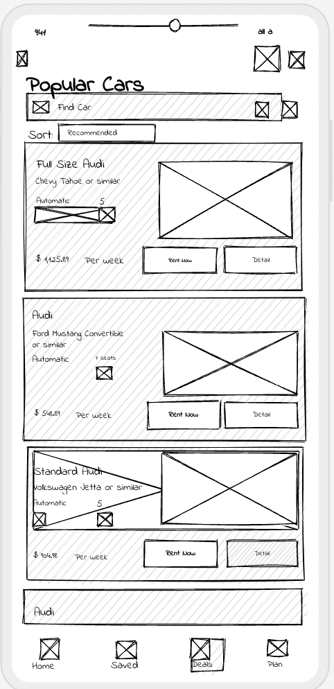
Car Rentals
Search for flights
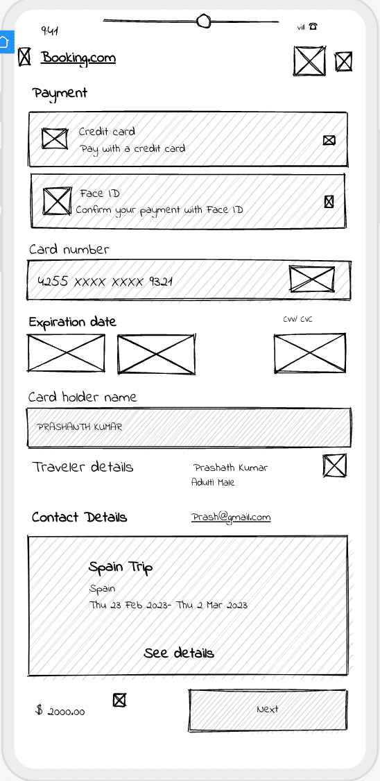
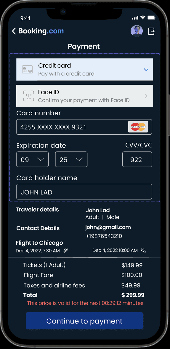
Payment
Customer details
Payment
Sign in
Sign up
Log out
Continue as guest
Offers
Stays
Flights
Car rentals
Chat Bot
Departure location
Arrival location
Filter based on price
Stays
Duration
Search for location
Select location
Filter based on price
Payment
Pick up location
Drop location
Key Observations

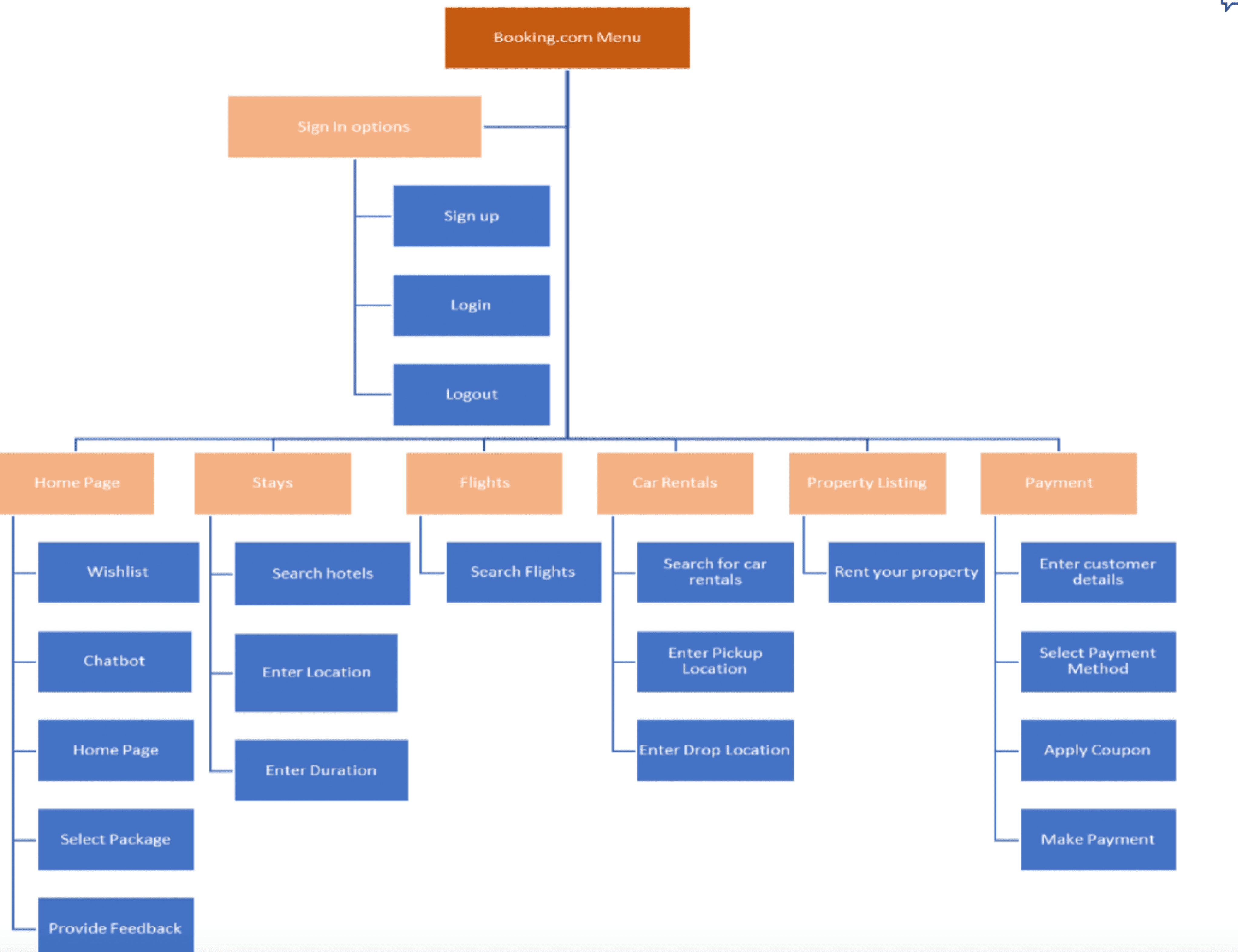
Information Architecture
Color Palette

We've maintained the same color palette for our redesign of Booking.com, and here are a few reasons why:
Trust and Reliability: The existing blue tones evoke a sense of trust and reliability, essential for users making important travel bookings.
User Experience: The color scheme effectively guides user actions, with yellow CTA buttons creating a sense of urgency and green highlighting positive outcomes.
Brand Consistency: By keeping the established palette, we ensure brand consistency while enhancing user engagement and maintaining the familiar, trusted feel of the platform.
Card Sorting


Low fidelity wireframes
3- Customer support
Most of the users complained about Booking.com having poor customer support

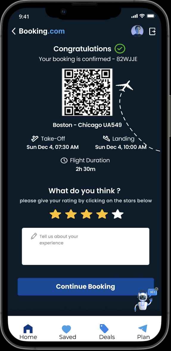
Creating an AI chatbot to help customers
get their issues addressed sooner


High fidelity screens
The journey from the outdated interface to the contemporary, user-friendly design has been shaped by a commitment to user experience, UX philosophy and a thorough understanding of user needs.
Legacy Design Challenges:
The legacy design posed several challenges, including a complex and unintuitive navigation system, lack of clarity in information architecture, and a dated user interface that hindered efficient use. User feedback highlighted frustrations with the system's shopping cart checkout experience, error handling, and the overall interactive experience.
User-Centric Design:
My approved design addresses these challenges head-on, placing a strong emphasis on clarity, simplicity, and ease of use. The navigation has been streamlined, adopting a more intuitive structure that ensures users can effortlessly locate the information they seek. Information architecture has been meticulously reorganized, enhancing the overall user journey. The user interface has been modernized, presenting a clean and visually appealing design that aligns with contemporary standards.
Positive Feedback and User Satisfaction:
The positive feedback received from users underscores the success of the redesign. Users appreciate the improved navigation, finding it more intuitive and user-friendly. The revamped information architecture has led to a reduction in user confusion, resulting in quicker and more efficient interactions. The modernized user interface has not only improved aesthetics but has also positively impacted user engagement.
Results
UX Philosophy
User-Centric Approach
The redesigns success stems from a user-centric approach, prioritizing the needs and preferences of the end-users. Regular user testing and feedback sessions were instrumental in shaping design decisions.
In conclusion, the Booking.com redesign showcases the transformative power of applying sound UX philosophy. The journey from legacy challenges to a user-centric design with positive feedback highlights the importance of continuous improvement, user feedback, and a commitment to creating interfaces that truly serve the needs of the users. This project serves as a testament to the value of investing in user experience as a driver of success in digital design.
Simplicity and Clarity
Embracing the principle of simplicity and clarity in design proved crucial. Streamlining navigation, simplifying information architecture, and presenting a clean interface contributed significantly to a more positive user experience.
Feedback and Iteration
Establishing a feedback loop with users throughout the design process allowed for continuous improvement. The ability to iterate based on user insights helped address pain points and refine the design iteratively.
Accessibility and Inclusivity
Ensuring that the redesigned application is accessible to users of all abilities and backgrounds is a fundamental aspect of UX philosophy. Adhering to accessibility standards has broadened the application's usability and inclusivity.
THANK YOU
Designed by Sindhu Srinivas Prasad
2- Information Overload for first-time users


Overview
This Case study is to fix Booking.com’s Onboarding experience, Accessibility, Aesthetics to reduce
shopping cart abandonment
My role
-The only UX Designer on the team
-Used Figma and Balsamiq
-Conducted User Interviews
-Information Architecture
Team
Agile/ Two week Sprints
Product Owners
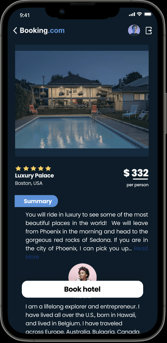
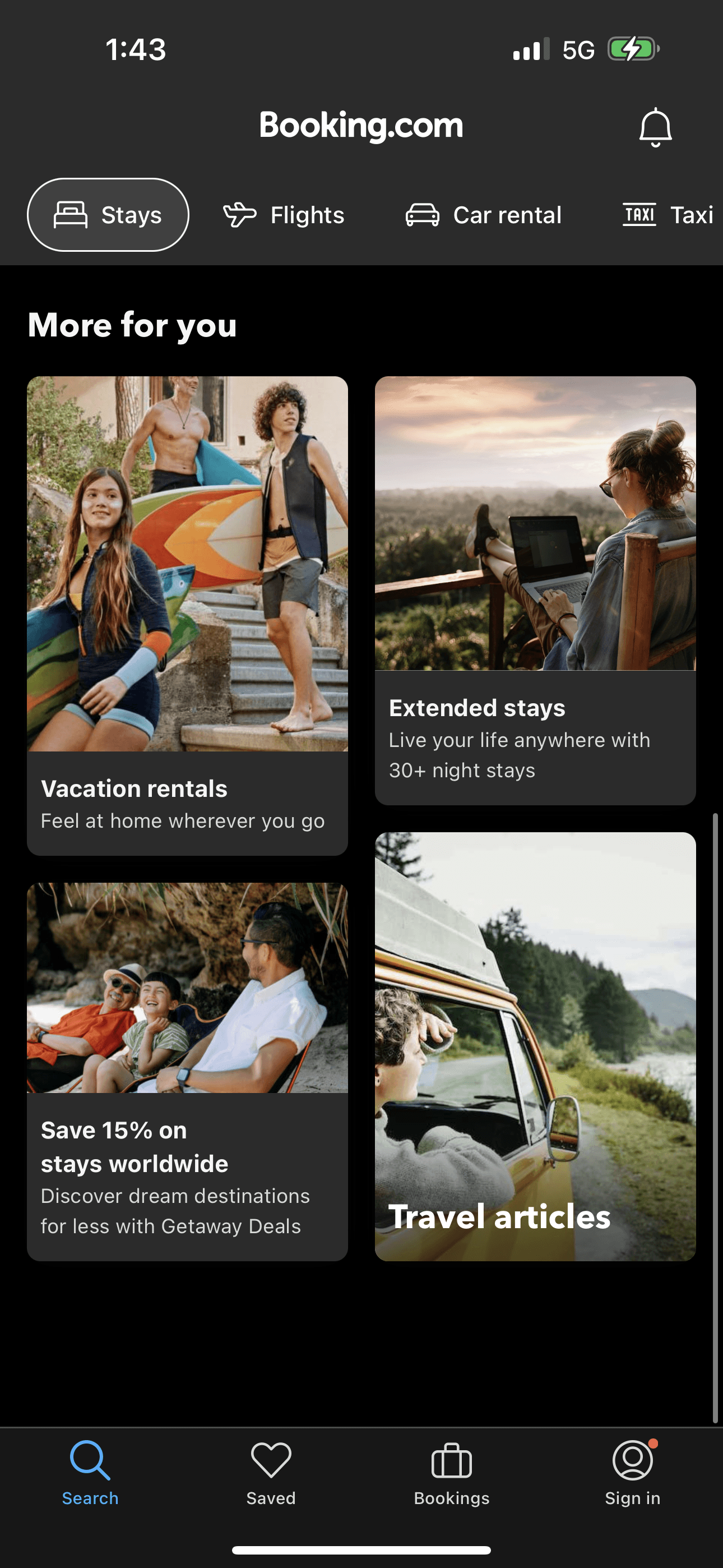
Final Design


The current onboarding experience in the Booking.com mobile application is inadequate, leading to a high rate of cart abandonment among users.
Problem statement
Goal
Revamping the existing Booking.com mobile application’s Onboarding experience, Accessibility, Aesthetics with the goal of mitigating cart abandonment caused by poor navigation within the app.
Addressing the issues
1- Poor navigation

No option for existing users to log in

The application directly navigates to a page
for users to log in as a new customer.
User onboarding made easy by navigating to a page for existing users to log in or for new users to sign up

1 - The study found that most of the users wanted clear and easy navigation without overloading them with information as soon as they open the application, this is achieved by providing first-time users with sign-in options as soon as they open the application without them having to navigate too much.
2- Users want to complete the booking with very few steps during payment, which also reduces shopping cart abandonment since there is less distraction during the payment step.
3- Users want to keep the homepage much simpler and easy to work with as it’s the first page a user is landing on, and it shouldn't get overloaded
Overall, the closed card sorting study conducted provided us with valuable insights into how users categorize the features of the application helped improve the user experience.